A Chronology of Books from 1970 to 1994
written on occasion of the show at Granary Books,
New York City, June 1994
Johanna Drucker
 |
The current exhibition contains works in editioned and unique form. In the late 1970s, the imprint under which the editioned works were produced was Chased Press (combining the metal chase, the gendered environment, and the chaste pun); by the late 1970s, I switched to Druckwerk, though a number of these works bear only a copyright and my name as the imprimature.
|
1970 -- A Story for Philip (unique book), watercolor, india ink, on drawing paper, 4" x 4," hand-bound in purple velvet. Early books (and sometimes later ones) were frequently motivated by thwarted, unrequited, or unrecognized affections. This was the case with A Story for Philip, which I made in my first year of college, at the University of Rochester, where I suffered a gruesome crush and made this water colored and ink drawn piece for a young man of the same name. To no avail. But with great enthusiasm. The one activity in that whole, cold, frozen, snow-bound and desperately introverted year which provided satisfaction. It was a unique book, made in a single copy, which I presented to him anonymously. Realizing the possible folly of this gesture and sparked by a sense of loss at having this one, first fruit of genuinely positive labor taken away, I made a second copy, this one, in order to keep something for myself.
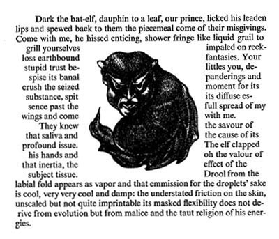
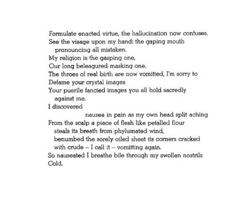
1972 Dark (edition of 13 copies), handset Times New Roman on Rives lightweight, stone lithographed images and end-papers, sixteen pages, 8" x 8," hand bound in red velvet. "Dark, the bat-elf, dauphin to a leaf, our prince, licked his leaden lips and spewed back to them the piecemeal come of their misgivings..." My first letterpress book, printed at California College of Arts and Crafts in a course on Creative Writing and Printmaking taught by Betsy Davids. She had just aquired her first Vandercook, and had initiated this course which allowed me the opportunity, skills, and means to make this first printed book. The edition was small -- I had very little cash, for one thing, and no access to a paper cutter, for another, so all the paper was cut by hand with a knife and straight-edge. The binding was self-taught, not quite standard, and I printed the lithos through masks because I had so much trouble keeping the edges of the stone clean -- thus the raised area which frames them. The text was fraught with repressed juvenile sexuality, perverse, victorian, and replete with images of wetness, slime, mucuous and other fluids and liquids. It was a book which emerged, whole, in one just a few sittings, the full, dream-like expression of some latent energy which had only awaited the opportunity, did not have to be coaxed into form. A not yet happy time, still living in a twilight zone of inability, social and emotional and sexual. Surfacing slowly.
From 1972 to 1975 I didn't have access to a press. During those years I produced two groups of unique books -- a constellation of odd little hand-drawn works in black and white, written in rhyme, which I thought might have commercial potential -- and a few elaborate manuscripts of creative prose, archaic, arcane, impenetrable and coded in their language. The amount of energy, time, concentration involved was in inverse proportion to my capacity to find any place in the world for these works. Needless to say, none of them ever found commercial publishers.
1972 The Real Whole Story of the God-thing (unique book), calligraphed in india ink, accordion fold, handbound in green cotton, approximately 8" x 10". "It begins with a processional, a circular profusion of attendants to the diety." Based on a pencil drawing, a single image, which evoked memories of my brother, on whom the text meditates.
1972 Light and the Pork Pie (unique book) watercolor, india ink, handbound, approximately 7" x 10". "A Pork Pie gone dancing, now prancing, now glancing at errored ways plays by herself in the dark..."
1972 The Story of the Pet Orange (unique book), watercolor, india ink, bound in purple cotton, approximately 4" x 4". A flatly ironic children's story.
1972 The Fruit and Vegetable Book for Children (unique book), india ink, handbound in green cloth, approximately 3" x 5". "Lemon girl would brush her hair if only there were something there."
1973 The Fruit and Vegetable Book for Children (unique book), india ink, handdrawn and lettered, bound in beige linen, approximately 6" x 4". "Avocado with only one shoe -- what is the other foot to do?"
1973 The Vegetable Recipe Book for Children (unique book), india ink, handdrawn and lettered, bound in beige linen, approximately 7" x 9". Contains such gourmet treats as "Steamed Carrots" and "Gumba Rice."
1973 The Girl Who Did Nearly Nothing at All (unique book), india ink, handdrawn and lettered, bound in blue denim, approximately 3" x 5". "Although it may seem I do nothing at all I can say with a great deal of pride, I am thinking of ways to explain to the world all the various things I have tried."
1973 Spice Advice (unique book), india ink, handdrawn and lettered, bound in printed cotton, approximately 3" x 4". No comment.
1973 A BaB at C (unique book), india ink, handdrawn and lettered, bound in blue denim, for my mother, an alphabetical nautical tale.
1973 Eat! (xerox) now lost, only have original mock-ups from which a few xeroxes were made, on the theme of eating -- dark and funny.
1974 Tomato's Rescue (unique book), india ink, handdrawn and lettered, bound in red cotton, approximately 6" x 6". A full-scale, forty or more page novel about a Tomato, a Zucchini, and other vegetable characters. Endless, with dozens of images.
In 1975, Betsy Davids had a grant from the NEA which she used in part to produce a book of mine; this brought me back into the Bay Area and provided access to printing facilities -- first through Rebis Press and then, in late 1975, through the West Coast Print Center, where I worked until Summer 1977.
1975 As No Storm or The Any Port Party (Rebis Press, edition of 326 copies), letterpress on Rives, with photoengraved plates made from ink drawings, bound in canvas with knotting and eyelets, thirty-two pages, approximately 10" x 8". Printed with Betsy Davids, from whom I learned to print, though never as carefully or exquisitely as she. The text described a disastrous New Year's party, transposed into a nautical theme of shipwreck.
1975 The Rite Soft Passage (unique book), india ink, handlettered in imitation of Bell types, on Arches, approximately 8" x 10", bound in black velvet with handlettered spine piece. A funereal text mourning an aborted relationship with a printer whose favorite types at the time were Bell and Bulmer.
1976 Twenty-Six '76 Let Her's (Chased Press, edition of 30 copies), letterpress on etching paper, originally with accompanying abstract prints, later abandoned (the paper torn down to eliminate the few finished prints), from fonts in a double case at the Print Center, owned by John McBride, who kindly let me use both them and his Vandercook, thirty sheets, 8.5" x 11" in hand-sewn cotton covered carton with ivory ring and shoe lace closing. The text to this work was derived from a trip to Los Angeles with Rebis (Betsy Davids and Jim Petrillo) to perform at the Vanguard Theater in Hollywood; the book was an alphabet book of private letters about a journey in the bicentennial year. Only who could tell? Different typefaces designate different registers of language. There is an annotated version of this in xerox which gives the gloss on the pages, replacing the skeletal extracts into a contextualizing narrative.
1977 Surprise Party (Chased Press, edition of 120 copies), handset prose in Stymie light, printed on colored tissue, four offset illustrations and illustrated cover, nine pages, 6" x 8". A nasty story about a birthday party I didn't attend.
1977 Fragile (Chased Press, edition of 200 copies), handset in Stymie light, printed on offset paper end cuts, bound in scrap carton accordion folded with packing label and string, twelve pages, 4" x 4". Printed entirely on my birthday -- three set ups, three runs -- in order to prove that I had been writing for a long time -- these poems from a manuscript written in 1971. Only one of many struggles for recognition from the mainly male poetry community.
1977 From A to Z (Chased Press, edition of 96 copies), handset from approximately forty faces, printed on Kraft paper, thirty-three sheets, 9" x 12", bound in plastic spiral. A pseudobibliography recording all the information, gossip, and poetry knowledge I had gained in two years' typesetting for the West Coast Print Center, plus a pulp-like account of a non-relationship based on a real crush I had had on a real poet; all the poems in this work are based on real people's styles, and all the characters, each identified by a letter, are identifiable. Finished a few hours before I left the Bay Area for a two year trip to Europe. I thought everyone would recognize themselves and I would never be allowed back -- hardly a problem, as it turned out. The structural premise of the book was to use each and every piece of type in the forty-odd drawers and use them once and only once and make a text which made sense. I nearly managed to do this -- only leaving a few odds and ends of numbers in the drawers at the end. The footnote pages, explaining the marginalia, were all set in one night.
1978 Experience of the Medium (edition of 10 copies, plus artist's and parents' proofs), printed at the Drukhuis in Amsterdam, in handset Garamont, on vellum, with ten sequential etchings, unbound, on German etching paper, handbound in canvas covered carton, 45 x 65 m. The ten abstract etchings were meant to show the way a visual system defines itself and its constituent elements through a network of relations; in the text a term is associated with each visual element and is in turn defined by the sequence of sentences in which it is contained; the work came out of several years' drawing experience focusing on process, markmaking, and organic visual "events."
1978 Netherland: How (so) Far (edition of 114 copies), also printed at the Drukhuis in Amsterdam, in Verlangde Mercator, on newsprint, eight pages, 10 x 15 cm., bound with split pins on scrap carton with toilet paper and carton in self-mailer. This was sent to friends and family to describe my impressions and responses to the Dutch environment -- which I found safe, suffocating, and conventional; one of the few poetry pieces I ever wrote.
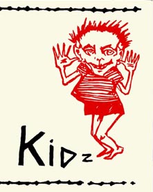 |
1979 Kidz (edition of 76 copies), negative silkscreened text on Rives lightweight, linoleum block and silkscreen cover on Rives heavyweight, four pages 5.5" x 7", bound with glue in the spine. Punk prose narrative refusing patriarchy in favor of bad behavior and anti-oedipal indulgences. Printed at the warehouse, mostly outside, back in Oakland, California.
|
1980 Italy (The Figures, edition approximately 500 copies), offset printed, about 60 pages, 6" x 7" or so, perfect bound. An account of a trip to Italy in 1978, with images from postcards sent to friends during that time; with the Dutch poem at the end. Thanks to Geoff Young and Laura Chester -- at that time the Figures Press in Berkeley.
1980 Jane Goes Out W' the Scouts (edition of 90 copies), letterpress printed in handset Century italic on Rives lightweight, four pages, 6" x 12.5", handsewn pamphlet stitch. A tale for a friend who was too fond of the little ones, with linoleum block prints for which Tamia Marg posed. This was done in the best possible form in order to meet the standards of the Fine Print crowd -- in material terms -- and thus force them to deal with my work (they wouldn't) as well as with the pure perversity of the content of this piece (they didn't). Printed in the garage of Rebis Press in Oakland.
1980 'S Crap 'S Ample (edition of 80 copies), letterpress printed, handset Stymie light, medium and bold, on Rives lightweight, eight pages, 5" x 10", in pages folded to different lengths as in a sample book, bound into linen paper cover, pamphlet stitched. A portrait presented in different levels and degrees of accessibility corresponding to the apparent and less obvious levels of personality. The covers were a combination of linoleum, potato print, and handwork and were printed in a cross-country trip in summer 1979 -- part in Texas, part in Louisiana, and handfinished on the train going West while I composed the text. Printed in the garage of Rebis Press in Oakland.
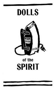 |
1981 Dolls of the Spirit (edition of 90 copies) linoleum cuts, handset sans serif type, on Basingwerk, fourteen pages, 8" x 5", bound with pamphlet stitch. Based on a Dutch emblem book of the same title, that about farm implements, this about transformative objects and prepositions. Written after returning to school, enrolled in University of California, Berkeley, where I had begun to study the history of writing and printing. Printed, I think, on my own press, newly installed in the warehouse in Oakland, though the actual date of that press's arrival is a little vague in my mind.
|
1983 Just As (edition of 500 copies), produced with a grant from L.I.N.E. foundation, thanks to the kind auspices of Judith Barry, produced offset, black and white, from images drawn with magic marker and pen, twenty pages, 11" x 14", highly illustrated, text blocks originally composed on IBM selectric, saddlestitched. A picture book of ordinary life transformed through condensation accompanied by text created in the same manner.
1983 Spectacle (edition of 10 copies), xeroxed from computer output, generated on a rather grim school printer, bound in velo binding, with pink paper covers. A long prose piece whose format was determined by the original notebook in which it was written out, about film theory, love, romance, history, Ben Hur, and other things.
1983-84 Against Fiction (Druckwerk, edition of 100 copies, with 25 others on newsprint), handset in Stymie light, medium, and bold, sizes 10 point through 48 point, on Warren's oldstyle, originally bound (badly) into black Arches cover, with odd linen spine piece glued to museum board, forty-eight pages, 13" x 16", illustrated with linoleum cuts. Images and text printed together in one run. This book took about 800 hours of printing time, including setting, running, distributing type and making images. The text had been five years in the writing, editing, typing, and much was changed in the composition process to tighten it up. All typographic oddities in the setting were dictated by necessity -- I would begin with standard conventions and substitute only when my supplies were exhausted. My intention was to use the tabloid format to open up the dense text for browsing. The text recorded a five year struggle with the desire to write fiction and the sense of its impossibility in contemporary literary context.
1984 Dream Life and Desire (unique book, one xerox copy), 8.5" x 11", based on dreams and fantasies of relationship, too private to show.
1985 Mind Massage (unique book), made from all kinds of papers, mainly Rives grey BFK, with foil, ink, goauche, handpainting, approximately 8" x 10" x 4" in the finished box, which contained the major text and several satellite books which were referred to in the main body of the book: Eusabia and the Victorians, Suburban Miracle, The Messages, and so forth. All done by hand through the Spring of 1985, in Paris, where I was suffering another crush, though inspired by it this tale of telepathy, diabolical bargains, and out of body travel. In a private collection.
1986 The Yellow Dog (unique book) handpainted in acrylic on rag paper, heavyweight, approximately 16" and 24", bound in some elaborate manner, with pages laminated at inside edges and folded on outside edges. Produced through a very long and very cold winter, my last in the warehouse in Oakland, while finishing my Ph.D. dissertation, and waiting for the phone to ring (sorry to say) -- another bit of bad judgement. A mystery tale set in Bay Area locations, quasi-sci-fi, which was much fun to write and paint, though tinged with bad memories of an unhappy time. In University of California, San Diego's Mandeville Collection.
1986 Through Light and the Alphabet (edition of 50 copies, only 25 of which were offered for sale), handset in various typefaces both metal and wood from the shop set up in Wurster Hall for the Visual Studies Program at Berkeley, on Warren's oldstyle, sixteen pages, 13" x 13", originally in Fabriano covers, some bound with museum board, others (five or six copies) bound professionally in 1992. A typographic fugue in which the theme is the continual proliferation of texts as subtexts and the possibility of a linear reading is undermined by format while the text is a polemic against the idea of language as the limit of experience. The justification of the pages was a major task, and as the book proceeded, became increasingly complicated. I would stand the small units of paragonnage up on a galley, and then justify them into larger units and so forth, rather than work in a composing stick. Many changes in the text were necessary to accomodate letters that stretched through two or three lines and had to fall in words in those lines. Done as a farewell to Berkeley, on the verge of moving to Texas, finished with my degree.
1986-88 Bookscape (unique book), a large (approximately 18' x 24" x 7") box in gold and silver foil to resemble a Neiman Marcus giftwrap, contains two levels of smaller boxes, each with a book object, made of paper of various kinds, with texts produced in all manner except by printing -- handlettering, stencil, typewriter and pin pricks. This book was conceived as a response to the Dallas landscape, which could not be described in the conventions of any prose form I knew -- not essay, not story, not outline, not narrative. The individual book objects were to reflect the postmodern object oriented architecture of Dallas, with its crystalline geometric forms, mirrored surfaces, and faux faux finishes. The book was about the relation between living a life and finding prose forms for its expression, specifically in relation to Dallas, but layered with examinations of the problems of writing feminine experience in conventions from a mainly patriarchal tradition. The book took two years to complete, owing to slack motivation and complexity of construction, and was mainly produced in a six week blitz of daytime t.v. watching in May and June before leaving Dallas, happily, for good.
1989 The Word Made Flesh (Druckwerk, edition of 50 copies) letterpress from many handset types, wood and metal, tiny copperplate in the red field, on Mohawk superfine, with red Moriki endsheets and metallic Lindenmeyer-Munroe cover stock, twenty-three pages, 10.5" x 12.5", bound with rivets. The counterpoint to Through Light and the Alphabet, this book attempts to halt linear reading to call attention to the physical, visual materiality of the page. The text is all about the visceral character of language, thus the referent is also material, non-transcendent, while the form uses format to render the text resistant. Printed at the Bow and Arrow Press in the basement of Adams House in a very happy year at Harvard, thanks to the kindness and generosity of Gino Lee and Jim Barondess. Printed in three runs -- the black wooden letters, the black smaller text and the red. Another justification nightmare. A play on carmina figurata of the Renaissance.
1989 Sample Dialogue (edition 10 copies) printed from various types at the Bow and Arrow, in colloboration with Emily McVarish, each of us writing one line throughout, to display the type collection, and to teach her to print. A few weeks of composition, but mainly printed in a single afternoon, adding ink slowly to change its color on the press. On Mohawk offcuts, bound in paper we marbled ourselves under Gino Lee's expert tutelage, and in a binding he taught us.
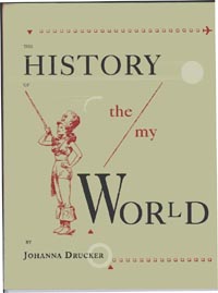 |
1990 The History of the/my Wor(l)d (Druckwerk, edition, 70 copies), letterpress in black and red from handset Caslon, illustrated with found line cuts, on Warren's lustro dull (which often causes the book to be mistaken for an offset book), with Bagasse cover and Fabriano endsheets, handsewn, forty pages, 10" x 13". Printed in several runs, small and large black type separately, red type, and red and black images -- about two hundred hours of printing time, I think. The main text undermines the metanarrative of history through its own cliches while the red type erupts, interrupts, with a personal memory of learning language in an intimate, even erotic, relationship with my mother -- this recounted as a critique of the feminist position that language is always patriarchal. The captions collapse family history with imagined history.
|
1992 Otherspace: Martian Ty/opography (Interplanetary Productions and Nexus Press, edition of 500 copies) a collaboration with Brad Freeman, printed in black and red, offset, on Warren's lustro dull, ninety-six pages, 6.5" x 6.5", smythe sewn and case bound. A narrative of cross-cultural relations, (mis)representation, knowledge and sexuality in interspecies communications, based on archival research into the history of images of Mars, as well as the diaries of Helene Smith for images of Martian writing, and so forth. Starring Amy Komisarek, who kindly allowed us to photograph her, and who also arranged the shooting locations. Photoshop work by Brad Freeman, with our pre-press time totalling about 1200 hours. Printed by Michael Goodman at Nexus, in Atlanta, with kind support of JoAnne Paschal.
1993 Deterring Discourse (edition, ongoing) laser printed and/or xeroxed, in Memphis (the closest thing to Stymie in my type library), with manipulated photos (crude) in response to current phases of imperialism on domestic, literary, academic, and international fronts. About 4" x 5.5", with neon covers, pamphlet stitched.
1994 Three Early Fictions (Potes and Poets, edition 30 copies), xeroxed on rag paper from laser printed originals, thanks to Peter Ganick and Dennis Barone, saddlestitched. A collection of three pieces of fictional prose written in the late 1970s, early 1980s.
1994 Narratology (Druckwerk, edition, 70 copies, of which 20 are hors commerce). Type and images generated on Mac, through Quark, and then output as film, turned into Polymer plates, then letterpress printed at the Bow and Arrow on Rives lightweight, forty-eight pages, 10" x 12", finished with handpainting in watercolor and gouache, bound into silk/rayon blend Japanese cloth, with Unryu, Kozo, and Tulip paper endsheets, foil stamped cover thanks to Barbara Mauriello. Binding with much assistance by Nora Ligorano at Lost Link in Brooklyn and some helpful labor by Brad Freeman and Marisa Januzzi. "The stories according to which the possibilities of living a life gained access to the psychic theater staging the events as real." The book is about the relation between tropes of genre fiction as models for women's lives and the lived experience of my own life -- sythesized and at time counterposed in this text. Images appropriated, redrawn, and reworked to suit the themes of Glitz, Sensual Romance, Sci-Fi, Horror and others.
The works on this list are creative prose which made it into book form at one time or another, in either unique or editioned form. I have made this as complete as possible, but of course, it does not include ephemera, printed posters, broadsides, performance texts, unpublished manuscripts, or other published pieces (in magazines or anthologies) of creative or critical prose.
-- jd