In 1964, Michelangelo Antonioni, an Italian director already famed for a painterly impressionism in black & white cinema, moved into color with Red Desert, starring Monica Vitti & Richard Harris. Il Deserto rosso was a landmark film in the use of color not merely as found material, but as a thematic element of the film itself, with long languid scenes in which hardly anything happened but the passing of a tanker outside seen through a window. In one scene, Harris finally beds Vitti in a white bedroom. The lights go out, but when they come back on, everything is bathed in a pale pink glow. Color, some people said, would never be the same in cinema.
Well, hardly. Antonioni’s next film, Blow Up, was a huge international hit – one of the defining films of the sixties, along with a few by Godard, the Beatles films, Bonnie & Clyde, Woodstock & Peter Fonda’s adventures as Captain America in Easy Rider. Antonioni used color, and a whole palette of other devices borrowed from photography in Blow Up, but where you saw this obsession with pigment or hue next was in Godard’s 1972 collaboration with D.A. Pennebaker, One P.M., requiring extras to show up in brown sports coats, literally gluing fake leaves onto trees to create the right seasonal effect, then again with Antonioni’s 1975 The Passenger, an attempt on the director’s part to again get back to the world market with Jack Nicholson traipsing through a scenic Sahara that directly anticipates Bertolucci’s Sheltering Sky.
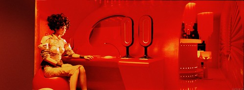
But the painterly use of color from film largely dissolves after this, only to return in, of all places, China, first in the hands of Yimou Zhang, himself a former photographer, especially in Hero, each of whose Rashômon-like versions of the tale is accorded its own thematic color – red, green, blue, white. Now I see it again in Kar Wai Wong’s 2046, a film that could have been subtitled Son of Red Desert. Why am I not surprised that, along with Steven Soderbergh (director of Sex, Lies & Videotape, Traffic and Solaris), Kar Wai Wong & Antonioni are directors of the anthology project, Eros? Color as a drug, anyone?
2046 has done well enough playing in the art houses in the US, that this year’s tally by the Village Voice of all the top ten, top twenty lists in American newspapers found it to be the second-highest rated film of the year, behind only A History of Violence. That’s pretty good for a film whose structure is prolix & almost haphazard (and which sort of dissolves toward the end). It’s a tale about that interesting border in relationships where friendship becomes love or love becomes friendship & what happens when one of the characters – the protagonist – really is closed off to love itself. Because his lovers seem invariably to live in the apartment next door, 2046, he writes a science fiction novel about a train that goes to that year, where nothing ever changes & from which only that tale’s protagonist has ever returned. All of this is set in Hong Kong, tho frankly it could have been shot in a studio anywhere in the world. Hong Kong, as you might remember, was incorporated into the People’s Republic of China on July 1, 1997, with the promise that the PRC would not interfere with its autonomy for 50 years: 2046.
But what makes this film is its lavish use of color & with the idea that the screen need not be filled – that one could show just its right side, as tho it were a swatch of paint on a larger canvas, or possibly just the left. The film is almost entirely shot in the deepest reds & palest greens imaginable. As is true in Red Desert – or in a black & white classic like Eustache’s The Mother & the Whore – the film develops slowly & often feels like an attempt to slow time down. Conversations are held with only one head showing, or only the torsos, there are repeated scenes focusing only on the feet as characters walk down a street or twirl round & round in a slow conversation.
What makes 2046 most interesting is the way in which it challenges the idea that films come in rectangles, yet of course it never fully breaks free – it was filmed to be shown in theaters, not on the side of art school walls. I had a sense – tho Krishna disagrees with this – that the bright yellow subtitles (the film itself makes ample use of Chinese inter-titles) often distracted from the pure red or pure green essence of a scene & I wondered what might have happened had the color of those words been coordinated with that of the screen itself. And then I wondered what this film would seem like to a person who was color blind.