Is it possible to produce a quality anthology of poetry on a single theme? More dreadful collections of poetry have been organized around the idea of the thematic than anything else, it would seem. Weddings, cancer, jazz, baseball, relationships with our mothers, relationships with our daughters, cats – a quick search on Amazon turns up six different anthologies of poems for or about cats, tho none that I could see by them. If it’s a noun, chances are it has an anthology of poems dedicated to it. Don’t even get me started on anthologies about Iraq, migration, nuclear disarmament or African debt – any anthology of the thematic is really a book about cats.
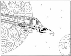
Mark Lamoureux knows this & has decided to up the ante some by requiring his new collection fit into the space of a chapbook, one generously filled with illustrations at that. And the noun he has chosen is decidedly at an angle also, as the title underscores in its wording: My Spaceship. The illustrations come from a black-and-white coloring book Lamoureux had as a kid – apparently he never colored it in!
My Spaceship is both a thematic anthology, as a result, and a send-up of the form. Precisely because Lamoureux isn’t the sort of guy to do anthologies on Corgies or faeries or childhood illnesses, the work herein is, shall we say, different:
When Mars Was A Candy Bar
I saw Captain Video
Scale the heights of Pluto,
But it was Al Hodge
Crawling across the studio floor.
Tree people, ray guns, machines
Arriving on God’s celestial shores.
I saw Flash Gordon,
The swimmer Buster Crabbe,
Battle Ming the Merciless
Space ships the size of light bulbs
Filmed in shoeboxes.
Sputnik soared over the Danbury Fair
I met Gus Grissom’s girlfriend
My name rhymes with orbit
I write in the name of my brother
Tom Corbett, Space Cadet.
Thus Bill Corbett. There are some really great works throughout this tiny collection: Jill Magi, Eileen Tabios, Catherine Meng, Noah Falck & Jon Leon all have terrific pieces here. I’d never heard of Magi or Falck before, so that is real plus. And if I don’t quite hear Christopher Rizzo’s piece, if Maureen Thorson’s couplets go limp after the third one (with 11 more yet to go!) or Scott Glassman only proves that what Bruce Andrews does is really much harder than it looks, that’s just the price you pay for organizing around a theme, even here.
My real quibbles – and I have some – have to do with design. The header typeface is Imazeng & mostly demonstrates why you should not buy your fonts from somebody who calls himself Pizza Dude – it is semi-legible at best & only the “cheat” of a table of contents in Zia Gera permits me to know that Steven Roberts really has work in this issue. That is, however, more than I can say about Nathan Pritts, whose name is left off the table of contents altogether.
So this pamphlet isn’t a home run, but it does make for a tasty palette cleanser (yeah, yeah, mixed metaphors, tsk) after all the dense Olson I’ve been wading through of late & I’m totally happy to have it in hand. Think of it as a paper airplane.
