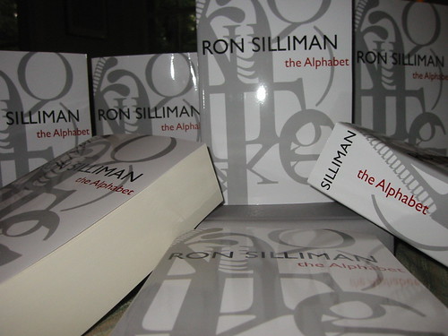
It’s here. Twenty-nine years after I jotted down the first words (the opening lines of “Force” actually), The Alphabet is real, tangible, and weighs three pounds. It arrived in yesterday morning‘s FedEx shipment, the driver lugging a 30-plus pound carton up to my doorstep. Each copy is nine inches high, six inches across, two and one-quarter inches deep. So deep that you can print my last name across the spine in 34-point type. 1,062 pages. 260,764 words, not including five pages of notes. Since Rae Armantrout collaborated on “Engines,” not every one of those words are mine.
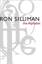
Geof Huth’s vispo, “The Construction of the Alphabet” looks terrific wrapping around the front & side of the cover (and reiterated as a theme visually inside), and Michelle Myatt Quinn’s design is impeccable. As I told one of my sons, visual poetry is virtually the only kind that doesn’t appear anywhere in The Alphabet. Having Geof’s work here both acknowledges that and to some degree incorporates it as well. If you are going to put this many of your eggs into a single basket, it’s important to get it right. And I must say that
Geof gives the book & design not one but two video presentations on his blog. Geof calls it “the poetry publication of the year,” which is generous, but which would no doubt send out even more endorphins except that I used mine up completely just looking at the book when it arrived. I think one part of me must have worried that I never would live to see this volume, the way Spicer never saw Book of Magazine Verse, let alone The Collected Books. Later in the day I realized that I felt ill from having expended so much adrenalin.
The
