M/E/A/N/I/N/G
Online
#2
Charles Bernstein
and Susan Bee
This is an excerpt from a longer interview conducted on August 11, 2000, in Guilford, Connecticut, and updated in New York in 2002.
James Shivers (JS): One aspect of your work Charles, that I have enjoyed, are the collaborations you have done with Susan. Looking closely, I have found that you two have been collaborating from the very start—editorially, in design, and more traditionally in the book form.
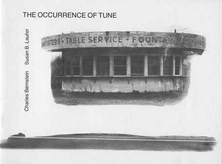
Susan Bee (SB): Yes, we have collaborated on five books together. And each of the volumes we have done are really different. The first was photographic (The Occurrence of Tune, 1981) and the next typographic (The Nude Formalism, 1989). They each have a different form. Some of them are in very limited editions, so not many people have seen them.
I have been trying to remember what was our first collaboration, since we met in high school, and we've known each other since I was 16. In college at Harvard, Charles directed plays before he was a poet. He directed Marat/Sade and I designed and illustrated all the posters and all the program material. So as I look back, this was over 30 years ago . . .
Charles wrote a few poems in college, but that wasn't his main focus and I had a visual background. I was at Barnard doing artwork. After that the first thing I think of, which must have come before L=A=N=G=U=A=G=E, was Parsing (1976) and Asylums (1975). I did the covers for both.
Charles Bernstein (CB): So we were working together. In the book covers and the designs, Susan was very involved. She designed a lot of things I was involved with—and not only the poetry books, but other projects as well.
SB: I also edited some of the Roof Books and did page and cover designs for them. I was already working as a commercial designer and editor when I did Parsing. I was at Hunter College Graduate School at that time as well where I was studying with all these minimalists and I was painting triangles. Everything I did was triangles, because my teachers were into very simple geometric forms.
 |
|
JS: Had they incorporated any notion of language at all?
SB: No . . . well, I was studying with Robert Morris and was aware of Robert Barry, who was also at Hunter, and they were both artists using language in their work. But I don't know that those relationships were so influential, their use of language was very conceptual.
JS: And by that you mean?
SB: It was tagged to an idea. It wasn't poetic language and I was much more interested in poetry and poetic language and in fact, poetic images than the conceptual minimal art I was being exposed to and even forced to study. Because I was a student, I had to do minimal art. They didn't like art with too much going on . . . they couldn't take it. So, it's kind of an irony of my entire career that I am a very un-minimalist artist and that I studied with very minimal artists. So, I spent my whole life getting away from those people! But I think it was educational because I had to paint in two colors for nearly two years and I also restricted my imagery a lot during that time.
JS: You don't normally do that at all?
SB: Never. I never liked it. I didn't do it as an undergraduate. In graduate school they really frowned on the fact that my work was so complicated. So it's been great to not do that anymore! Which ties into my design of L=A=N=G=U=A=G=E.
CB: The design of L=A=N=G=U=A=G=E was one of the things that was striking about it. In retrospect you see that in Steve Clay and Rodney Phillip's show and book, A Secret Location on the Lower East Side (NYPL & Granary, 1999). Just in terms of mimeo, and so on. It had a very different look from the other publications at that time and it was very striking to people how different it was.
SB: I discuss these design issues in the article, "Design Elements in The Nude Formalism and Fool's Gold" (Talking the Boundless Book, MCBA, 1995).
CB: I thought there would be more reaction to The Nude Formalism, because it was such an ideological, overt intervention in typesetting.
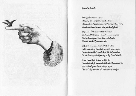
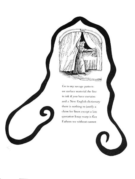
JS: I did want to ask you about the setting to the poem "Freud's Butcher" in The Nude Formalism. On one side of the spread is the poem and on the other side is a picture of a hummingbird. How did the design proceed?
 |
|
SB: I tend to have slightly absurd, slightly strange readings of the poem. The poem is very funny and ironic and I wanted to have a very witty setting to the poem. What I was thinking about . . . the poem talks about a friend of ours, whose mother's uncle was Freud's butcher. But it also discusses—art, religion, and the new poetry. I love the last line: "Art and religion don't always agree/ The one's by rule, the other sometimes free." That line conjured up the tiny hummingbird perched on the lady's hand. It's an ambiguous image in which it is unclear if the bird is being captured or set free.
CB: The poem existed before the setting.
SB: Charles didn't have anything to do with the setting. I chose the poem. The images came after it.
CB: You chose all the poems, to a large extent. I had an idea of what the setting would be, but we actually had more poems and Susan chose and selected them from a large group. She even asked for some I hadn't at first thought to include. So she played a large part in determining the text. To some degree I had a basic idea, but she picked other pieces, and then the text was established and I had nothing else to do with it.
SB: The correlations between the images and the poems' are oblique and intuitive, which may make them hard to discuss. I enjoy the serendipity of how Charles changes things in the middle of the poem. I wanted the idea of something appearing suddenly, like magic, like a rabbit out of a hat. So I think that was my sense of the poem. In other words my readings of the poems aren't very direct; they are not meant to be illustrations exactly and that confuses people. It's more like a serendipitous or whimsical relationship, not a straight illustration at all.
JS: And did you take that kind of attitude into the making of Little Orphan Anagram?
SB: Yes. It's definitely that. There I really chose the text. I took a bunch of poems that mostly had not been published and sometimes only took one line of the poem to set. So in a way it's really not a manuscript that Charles would have published at all. It's more that I chose what I wanted . . . what called up a visual image to me.
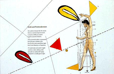
JS: "Verdi and Postmodernism" is a piece I don't think anyone has discussed in its version in Little Orphan Anagram.
SB: I wanted to use that poem because of the title, which is so evocative. I love the lines that start the poem: "She walks in beauty like the swans / that on a summer day do swarm . . ." Those opening lines conjured up the woman, nude except for high heels, who is trapped like a swan or a specimen of natural history in the geometry of the grid, which literally measures all of her features. This is an image I found in a drawing manual from the 1940s. I thought of the contrast between the extravagance of emotion in Verdi's opera and the rigor and distanced irony of postmodernism. The poem addresses both humor and serious issues, especially in the last line: "If I could make one wish I might / overturn a state, destroy a kite / but with no wishes still I gripe / complaint's a Godly-given right."
 |
|
JS: And the grids?
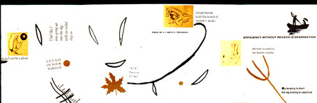
SB: I was using the grid in my work due to being around "grid-y" people. I actually have used the nude and grid again, and in a recent collaboration. I have done this big painting for a show in New York (Sprung Monuments, for Poetry Plastique curated by Charles and Jay Sanders at the Marianne Boesky Gallery, February 2001). It is a painting made up of a grid and panels. It's like a cartoon or storyboard for a film. Each panel has a poem, each poem has an illustration.
CB: And we wanted a painting for the show itself. I was looking for a painting.
JS: Would you see this new work, where you bring Charles' poetry into your painting, as a result of your previous collaborations?
SB: To me, this painting is a culmination of all the previous projects. Paintings are different in scale from what I think of as artist's books, or collaborative books.
CB: Once again, the text was completely chosen by Susan.
SB: I had already chosen some poems from Little Orphan Anagram, and I already had them in my computer. But the painting is a totally different take on the poems. It's not an "illustration."
CB: Getting back to The Nude Formalism, there's a phobia against the kind of neo-Pre-Raphaelite ornamentation of page that comes from, let's call it, a Bauhaus aesthetic about type design, that the type shouldn't interfere with the poem itself (wherever that is). That if the type or page is decorative, the poem is somehow diminished.
JS: Granary Books, along with Johanna Drucker's work, has been pushing the idea of the total book, where the language, page, type, design and the formation of the book itself are accepted as vital elements of the constructed medium. Your term Charles, "poetry plastique" is also locating and articulating this grammar of the total book and accepting that these elements, notably the visual element can be utilized in a number of different ways. This is a very different point of departure than conceptual art or concrete poetry . . .
CB: That's right.
JS: Although all books must have these elements such as the visual, the semantic, and the physical, rarely are all these parts drawn upon.
SB: I feel like I'm writing an opera, or music to a libretto. In other words, he gives me the words, and I get to set it. Back to how I view it—our collaborating. It's not a one-on-one thing. That's why even that image (from "Verdi & Postmodernism") and that page does not predict the poem. As I mentioned, the image is one I have used in other works. I picked it out of another work and added it. I thought it went with that poem. I liked the idea of a nude turning into a formalist element that was taken apart and revisualized. It goes with Charles' poem, and what he's said about his work. I've already read much of what he has written about his work, and lived with him! So I feel like I have some insight into what he thinks and therefore I feel free to set the poetry in whatever way I want.
CB: It wouldn't matter if the designs were illustrations of what I think.
SB: In contrast, when I worked with Susan Howe on Bed Hangings (2001) I was more circumspect in my approach. She sometimes objected to what I did, and didn't like certain images and had me take them out. Charles rarely does that.
 |
|
 |
|
CB: She's more interested in consonance, and I'm not as interested in that.
SB: She wanted me to reflect the poems, and with some images she said "you can't use that image . . . it's not in the poem."
CB: Or "it's not historically accurate."
SB: This approach is usually the last thing that is on my mind. That kind of matching I've never done with Charles' work.
JS: What informs your "matching"? You have this kind of freedom? How do you guide it?
SB: I use lots of images. I have a huge collection of images, of collage images. It's more subconscious/unconscious. It's like art, I just look and when I see an image that I think will go with a poem, then I use it. But with Susan's work, it was different. I couldn't just pick the image out of my collection. She has historical references and didn't like the kind of images I was using as they were not historically accurate. As a result, I was working with a smaller range of images, based upon my research, and the result is a much closer correlation of poems and image. In contrast, The Occurrence of Tune was a whole poem. The photos predated the poems. I had already done the photos.
JS: How did you decide on the format?
SB: The lines are really long. I wanted the horizontal format. We also wanted the big type, so it would not be like a conventional poetry book.
I love the fact that the format is almost like a children's book or a workbook. I printed the photos and painted the developer on them. I had a darkroom at the time. I did all the developing myself and these images are from my experimental photo period. The images are very poetic and not hard-edged and my approach is very lyrical, as opposed to the approach to photos and slogans of somebody like Barbara Kruger, who was working at that same time. Even in the painting I did for Poetry Plastique, the poetry is used almost like slogans, but with very poetic and nonsensical texts.
JS: So, how are you thinking about language, having brought it into your canvas not from a conceptual viewpoint, how is that changing your perception of the visual?
SB: Well I think of it as a counterpoint. I work with collage anyway, so I'm already bringing things in. In a lot of my paintings I've used slogans from movie posters. That's why it's funny that I never did put any of the poetry into the paintings. Now, because of the artist books we've done, we have an audience. I realize that there may be an audience for incorporating the poetry into the paintings, but I could never figure out how. Even now I'm not exactly sure that I would continue the way I did. The words can interfere with the visual. Purists don't like having anything interfering with the visual, and the more painterly people I know in New York, just want paint. No collage—no interferences, pursuing a purism about art. And since I came out of a painting context, I had this purist ideal, but it never appealed to me.
CB: And then there's plenty of writing in painting in the past 70 to 80 years, but it tends to be more photographic art, slogans, narrative, conceptual rather than poetry or poetic text, poetic material.
SB: I'm more interested in Blake's marriage of poetry and art than in the approach of the conceptual artists I studied with. I found that when they did use texts it had something very deterministic about it. It was like the text was this very heavy object weighing the work down, as in the work of Joseph Kosuth. His work seems very serious to me. I want to have a more humorous, light-hearted, and whimsical quality. I think all my pictures match up to the texts that they are with in some way. I could point to the match if you sat me down with all the books, I would be able to say why the images were put together with the text in the way that they were.
JS: I think it takes a changed perception to not demand an exhaustive explanation between the visual and textual field, so that the viewer does not have to understand all the "whys" in order to receive and live with the work. If you have a larger set of references, you can let them be side by side.
CB: However, it is a whole other question when a book has only 35 copies, each hand painted, as with Little Orphan Anagram.
SB: For Little Orphan Anagram I had to watercolor for six months. It was very arduous. I love the way it looks, but its actually insane doing the whole project. I would get up each day, go to the studio, and watercolor all day, and then at the end of the day, I would have a thousand more pages to do!
JS: The difficulty of reading The Occurrence of Tune is in the manner you are collaborating. Instead of merely illustrating poetry, you are building an interactive space, each maintaining independence but living side by side.
CB: Right. It's less familiar even if regarded as something sort of nice. But in terms of poetry, it is always the full-length, text-only, collection that is deemed most significant. Each of our books is a separate work. Each book project becomes crucial in imagining what my work is. The Nude Formalism is a crucial work for understanding everything I did from that point on. Because it gives a very clear visual correlative to the more Pre-Raphaelite direction the poems themselves take. It's very clear when you see the poem that it is going in that way. It's a shift from the poetry that exists prior to that, in terms of my work. And that would include my collaboration with Susan too.
JS: Tell me about Fool's Gold (1991). How did you and Charles collaborate on this project?
CB: We had a residency in Tucson.
SB: The format of Fool's Gold was determined by the publisher Charles Alexander of Chax Press and it was printed in an edition of about 40. You brought some texts with you.
CB: I brought, not even so much texts—
SB: Snippets?
CB: Fragments—lines, and other kinds of things I wanted to use, things I was going to use to create poems . . . elements and there were a couple of poems in there and then we sort of assembled it together.
SB: It was the beginning of my way of working with little snippets . . . I would place a snippet over here and then over there.
CB: I provided a series of fragments and in some cases I filled in a visual element. Some of the visual elements, were generated by me, which is different than the other books. I was the most involved in this project, writing things in interaction with the book as it was developing, even though most was written beforehand, like "O! O! / I'm in an / O! tree." I mean, did I write that after you put a tree in? Maybe. I can't remember. Some of the phrases, other kinds of things, slogans, those were written beforehand. Things I had written and had in mind for this project—for you to use because we knew we were going to be doing the book there in Tucson.
 |
|
JS: How does this differ from The Nude Formalism?
CB: The Nude Formalism is about typography and the relation to poetry, but that is not the only thing in this book, of course. The visual collage –the images—also. One of the things about The Nude Formalism is the use of different fonts and to have each poem set in different fonts, which is something I've been interested in for a long time. The whole idea of uniform fonts . . . we wanted to open up and bring out other possibilities.
SB: We didn't want the transparency, where everything is nice and tasteful in normal chapbooks. A lot of people didn't say it, but thought, "Oh my God. The fonts are advertising or display fonts that have never been used with poems."
CB: It goes against the dominant aesthetic in poetry publishing. But then so do the poems.
SB: And I was working, designing a lot of Roof books, which were fairly conventional. I would even try and change the headings—make them look more decorative—and the authors would get upset.
JS: You were pushing against a conscious design philosophy.
CB: It is not conscious, necessarily; it's a modernist's idea that you could have a title but it should be integrated with the main body of the poem—and the type should not call attention to itself. It's as if you want the text to be an extension of the typewriter, the uniformity of the typewriter. It's the illusion that the linguistic material of the poem exists independently of the actual visualization in the type. The type should be something neutral.
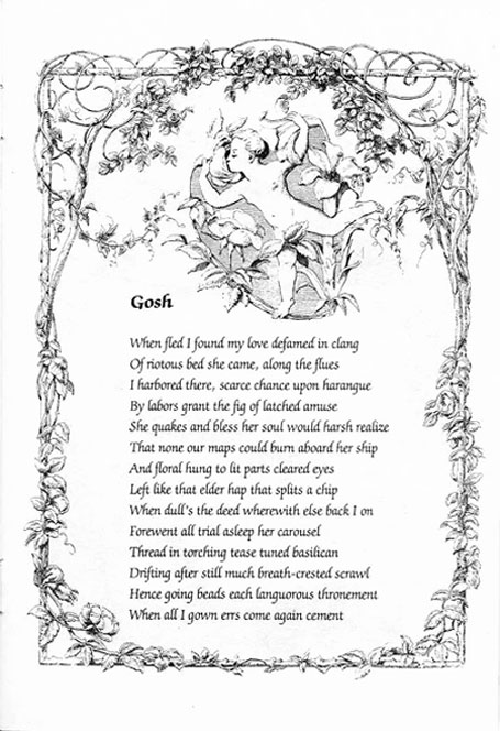
SB: And I was really against that. It really violated my sense of aesthetics. In The Nude Formalism I did not want the type to be neutral. I wanted it to be decorative. I wanted it to be flowery and decorative as in "Gosh." And in "A Soul Foiled, Abjured," I used fonts that were for wedding invitations. Each poem is pretty much set in a different font, and I used every font I could find. This is before the computer. I actually had all these typed up by a typesetter and pasted them up. I didn't have the fonts myself—of course, now I do. Back then, it wasn't that easy to get a hold of these weird different fonts and to find someone to set it for you in these odd formats. Now I think, with desktop publishing, it is taken to an extreme, too much use of fonts.
 |
|
JS: In other words, a use of type with a lack of history.
SB: They don't even know why they're using different fonts.
CB: Well, the problem is that having access to a lot of different fonts does not make you a designer. Because I am not a graphic designer, I couldn't have done The Nude Formalism. Which brings up the issue of the separation between the verbal and the visual which is in our . . .
SB: In our family.
CB: It is pretty systematic! I look at a lot of visual art, and I'm very interested, but I don't feel that I have the visual acumen when it comes to font or color.
JS: Susan, how did you learn about fonts?
SB: I grew up around them. Both of my parents were fine artists, calligraphers, illustrators, and book designers so it's kind of in the blood, to put it mildly. I used to sit around, as my mother worked at home on diplomas and illustrated children's books. She was a painter as well as a commercial designer. She even worked as a sign painter in Palestine. So knowledge of fonts was around in our house. I was always taught to look at typefaces. I was taught to look at decorative types, since they both did decorative calligraphy for a living, I was always finding these incredibly beautiful pieces coming out of the house like certificates for the governor. My mother did gold leaf and fancy borders and all that at home. And I was at home watching her making things. So I always wanted to make these things and grew up in a household where everybody was into books and design and type fonts. And then I started working as a designer. I worked for the National Association for Social Workers and they had the worst taste. I would show them four cover designs, and they would always chose the worst one, and put it in the worst colors like mustard, and destroyed my designs. So now I have this freedom where I can make things and I'm really happy that I have publishers that publish my work.
CB: Even now, when you're dealing with some university presses, they are very conservative as to typography, and the cover type and so on; and there's a real fear of ornamentation and visual complexity; that's partly because they think it will interfere with the basic functional quality of making the writing unobtrusively available to the reader. Still, there's a lot of bad muddy design, too. Like on the web, when you have red backgrounds with pink type and you can't read the words.
SB: I always wanted the collaborative books to be legible. I think you can read the poems. I never wanted them to be unreadable, in the way you find in some artist's books.
CB: On the web, you see a greater deal of overly formatted design—too many frames, too many pop-up mini-windows, too much tiny type. We try to avoid that at the EPC (Electronic Poetry Center).
SB: I'm definitely not into illegibility.
CB: You can have illegibility when you want that feature. Most of my visual work is about illegibility, which is a different thing. The actual writing tends to make the writing illegible, rather than the choice of font or background. In our collaborations, without sacrificing typographic legibility, we wanted to stay playful.
JS: You can see that very clearly in Log Rhythms (1998).
CB: In that book, the poem predates the design setting. So all the designs are Susan's but I actually did get her to do something. There was one point, where this particular page—pages two and three in the final book—
SB: He didn't like the way I set the stanzas!
CB: I was concerned that it appeared that there were four stanzas, instead of one, as I had it in the manuscript. Though actually if I think about it, it was an unnecessary concern, but that was one of the few concerns I had. Did you actually change the design?
SB: No. You told me you gave up!
CB: I think I was just reorienting myself to the new environment.
SB: What happened was that this was a completed long poem. It wasn't like the other ones where I could scramble it. It had an order.
CB: Originally, it was one stanza, composed of four different elements. The two different kinds of children's rhyme—nursery rhymes—plus two other parts. They were separate elements, but I had worked to make them converge in the one stanza—they were meant to mesh. So when I first saw them separated I was nervous or unsure they would work autonomously because they weren't meant to be arranged that way.
SB: When Charles gave me the text of the poem, I pulled it apart, because I didn't know how I was going to use it.
CB: Steve Clay actually heard me perform the poem at Dia in New York. That's what got him interested in publishing the book.
SB: Steve wanted it set, and he called me to ask if I would do it. I had no idea how . . .
CB: It's like The Occurrence of Tune in that way. But The Occurrence of Tune exists more as a separate text. The verbal and visual elements are more distinct.
SB: Yes.
CB: In Log Rhythms, there is more freedom taken with the . . .
SB: Liberty . . .
CB: Liberty . . . but actually the text remains in the order it was written, even if sometimes the stanza breaks are different in the original.
SB: And where I broke the poem on each page. Also you didn't have it centered line by line in the original. Charles got a little upset when I started centering the lines! I wasn't as confident with The Occurrence of Tune and worked in a more conventional way between poet and artist. Many poet and artist collaborations look as if they have nothing to do with each other. It's more like they are working side by side, but they are not interacting.
CB: It can work. Creeley responding to painting is very interesting.
SB: He often writes the poems after the painting . . . he responds to the painting.
CB: And they are very rich responses to the paintings. When you write an opera, you write the words first so the composer can set them. The writer's work ends just as the composer's work begins. But in opera, the writer is the secondary person.
SB: Yet with Richard Tuttle, he had the paintings and you wrote a poem for each one (Reading Red, 1998).
CB: And then Richard designed the book and put them back into the paintings—literally superimposing the poems on the image of the paintings. That was very interesting. In Susan's case, she incorporates the poems into the visual field—rather than keeping the visual and verbal separate. Though I like that tradition of poems side by side with the paintings . . . . I believe what Susan is involved with is something different. They're not paintings illustrating poems, or poems about paintings. The poet takes, in some degree, a secondary role in this work—because, not that the poem is insignificant—but the visual work is beyond the poem, it's an extension of the poem into a different medium. There are plenty of books of visual/verbal collaborations which are equal or the text is dominant. It's kind of interesting in artists' books, the artist is leading in the way in the opera the composer's leading. It's not that the text is unimportant, but in the end, it's the composer's medium.
SB: Working on the penultimate stanza of Log Rhythms ("The gift is always . . . ," p.18), I remember going in to Charles and asking him should I work on the image as a gift and he said, "No don't be literal!"
CB: Well, there you ask me not a visual question, but you asked me . . .
SB: But it was a visual question . . .
CB: But I took it as a question of interpretation, of semantic emphasis—
SB: Well, I was just trying to figure out what was the important theme of this particular passage.
SB: What I ended up setting was "let language lead," which is the last phrase of the stanza. I concentrated on the idea of language and people leading out from the poem. At first, I had this funny idea that I would put an image of a "gift" in, because the poem mentioned "the gift" but I knew that was ridiculous—the poem also has "package" and "commodification." So I had this package—and how should I set it?
CB: The reason I said that about the gift . . . I didn't want to emphasize the image of a gift, a one-way package, because the key is exchange. And the arrows in the graphic did suggest that—reciprocity in multiple directions.
SB: Sometimes the images and design are very direct, like "the puppy is father to the dog" (p. 17) and "The mouse chases the cat but only in the poem" (p. 17), where there is an image of a dog, cat, and mouse running around the border of the poem. Then the spread on pages 14-15 suggests being in the woods, because we were in the woods when Charles wrote the poem.
CB: Like any reading—you pick up on certain things.
SB: How any section will be set is not that obvious. Each spread is very different, inconsistent, which is one of my favorite things to do, and reflects my style.
JS: The reason you are interested in inconsistency is because you were reacting against minimalism?
SB: And also because of Charles's work. I think his work and my work are very similar. I use collage, and a lot of different styles. I allow myself to use a lot of different styles, but not in a programmatic way. So I think the nonprogrammatic sense of the poetry and the fact that his poetry is collage-based also allows me the freedom to do what I want. When I collaborate with other people—I did a book with Johanna Drucker (A Girl's Life, 2002)—it is very different. Johanna had already written the text, but I did the visuals and she took the visuals back, and put the type in. Then the overall design was reviewed and altered by both of us working together. She is an old friend and I've always showed her my work, but we have never worked together, so it has been a very interesting project for both of us. And we are very pleased with the outcome.
 |
|
JS: Susan how have you been affected by Charles's work?
SB: Living with a poet, listening to hundreds of readings, it has been a very big influence on me.
JS: Charles how have you been influenced by Susan's work?
CB: Certainly we share an interest in fragmenting, layering, and collage, but Susan was always interested in some things that early on, in the 1970s, I had a hard time with, certain kinds of figurative elements and certain kinds of Rococo, Pre-Raphaelite, decorative qualities, which aren't present in my early work, which is more austere. I began to see the possibility of including that kind of material—both the comic possibilities and the textual possibilities. There were not a lot of other people doing this sort of work when we first started, but Susan pushed ahead with this verbal/visual work.
JS: When you met over thirty years ago, why were you interested in incongruity, fragmentation, the abstract? And why have you maintained this ongoing interest in these modes? Unless, you are creating a new type of writing, it seems you've maintained, for quite a long time, a resistance, but have created a new kind of style.
CB: When I was young, I was very taken by a very abstract formalistic aesthetic—formalist in the sense of Greenberg. And even reading someone like Stein, I was thinking of the consistency of abstract texture. Then I think Susan and I both became increasingly dissatisfied with parts of that aesthetic, especially the austerity, and more interested, sometimes in overlapping ways, but also at slightly different times, in montage, incongruity, decoration, figuration, and, inevitably with that list, the comic.
SB: I think our work is recognizable as our work; stylistically it is a unified thing . . . but it took a long time to get to that point and both of us went through a lot of styles before we came to do whatever it is we are doing now. I went through my photo period, my abstract painting period, my geometric period. I went through every which thing, each one thing different, in the last 20 years. I have started using a lot of kitsch things, more paper dolls, stuff from my childhood. Imagery I was afraid to use before because I was afraid that I would be despised or not taken seriously enough for what I was doing. Now I don't care. I do whatever I want.
CB: These are the kind of elements I also became comfortable with including. I'll give you another example: children's rhymes, which I didn't have in my earlier work. Needless to say, having children affects that, even in the most basic sense of coming into daily contact with different literature than I was otherwise thinking about and also crucially reading out loud to Emma and then Felix. Illustrated children's books are a great example of visual and verbal integration. I'd love to do a "bath" book printed on thick plastic pages with flaps and parts you can pull out. I think overall my own work has a very strong connection throughout. This continuity is not a matter of style or rhetoric, though. I don't feel like I've gone through a revolution or change in relation to my preoccupations—which may not be totally a good thing or, for that matter, a bad thing. A lot of the aesthetic and social interests I had when I was younger, I still have now. I have just found different ways to articulate them, different forms and materials to use.
SB: I think the playfulness in both our work . . . is something we've allowed ourselves to have more and more. In other words, after a while, I stop caring what the art world thought, because they didn't seem to think that much anyway! And I just did whatever I wanted to do. In the books I felt even more freedom than in the paintings. Painting has a history to it. You can't make any mark without it being read as being informed by Pollock or somebody. I don't know why, but I feel more freedom in the book. It is more like drawing. Drawing is always more personal.
CB: It's like Poetry Plastique: our collaborations are not visual poetry, they're not illustrations of poems, they're not concrete poetry, they're not poems about paintings.
JS: It's a fascinating area. As a person interested in the visual arts and poetry, these works produce an interactive dialogue between the two forms. It also shows that your collaborations are creating a third form.
CB: I think that if you really want the collaboration to work, the poem has to aspire to the condition of the fragment. Or, to put it another way, of a song lyric: you know, how, once you know the song, a lyric feels insufficient on its own but also brings the music to mind. In The Nude Formalism, for example, the poems feel like they need something else to make them work; the visual setting feels necessary.
SB: The trick there is to bounce off the words, take the work into new visual directions, ones that are suggested by the text.
CB: The collaboration is less about illustration, interpretation, or explication and more about extension: the continuation of the poem by other means.
Susan Bee will show her paintings and her mother Miriam Laufer's paintings at A.I.R. Gallery in New York in February 2006. She has published six artist's books with Granary Books, including The Burning Babe and Other Poems with Jerome Rothenberg, Bed Hangings with Susan Howe, and A Girl's Life with Johanna Drucker. She is coeditor of M/E/A/N/I/N/G: An Anthology of Artist's Writings, Theory, and Criticism and teaches in the School of Visual Arts Graduate Program in Art Criticism and Writing. Her home page can be found here.
Charles Bernstein's most recent books are With Strings and My Way: Speeches and Poems (Chicago), Republics of Reality: 1975 - 1995 (Sun & Moon), and A Conversation with David Antin (Granary). He is S.U.N.Y. Distinguished Professor at the University at Buffalo. His home page can be found here.
James Shivers has written the first full-length study on Charles Bernstein entitled Charles Bernstein: American Innovator (forthcoming). He has published poetry and criticism in Europe and the US. He is a Visiting Fellow at Yale in American Studies and is working on a novel, J4.
| Table Of Contents: |
| 01. |