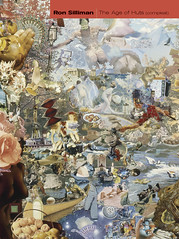
Like George Stanley’s
forthcoming selected poems, A Tall,
Serious Girl, Besmilr Brigham’s selected short poems, Run Through Rock, derives its title from
the final poem in the volume. The book has a spare, almost austere beauty to
its design. The front cover is a color photograph printed in landscape format
about two-thirds up the page, behind which runs a vertical band of gray that
holds (above the photo) the book’s title and (below the photo) subtitle, author
& editorial information. You can just barely discern that this pattern
forms a cross. The photo itself is of a rock atop some exceptionally dry &
tire gouged red clay earth – in the deep background, so soft focused as to be
open to interpretation, are either clouds or hills underneath the deep blues of
a storm sky.
The back cover presents the
same pattern – the photo is now a color negative – as the front. Underneath the
photo, printed in the grey column (that same subtle cross) are some lines from
one of Brigham’s poems.
Run Through Rock is a careful, professional project in book design –
its only flaws (& you will see that I’m reaching to find any) a couple of lines
here & there that are ambiguously leaded, making it not quite clear whether
or not a new stanza is upon us. As is equally evident with its 2000 reissue of
Frank Stanford’s The Battlefield Where
the Moon Says I Love You, Lost Roads has become one of the premier
publishers of American poetry. Every attention to the detail of the book is
taken & the eye to presentation is exact.
The cover of Battle
Thrusting up from the bottom
of the front cover – I’m choosing my words carefully here – is the same sort of
column that appeared beneath the photo on the Brigham cover, with the author’s
name dropped out in white toward the bottom and the book’s title above it as
the column moves from black to a rich deep red.
The back cover has a small
square photo centered roughly three-quarters up the page: two toddlers,
Caucasian, playing with a slightly older African-American boy in some kind of camp setti
As moving a graphic design as
the cover of Battlefield is, it may
be tame in comparison to the one printed on the 1977 first edition of the
volume, back when Lost Roads was the name of a magazine – Battle
The books aren’t even the
same size: the 1977 edition taking up 542 pages, the 2000 edition offering the
same number of lines in just 383 pages. While the two volumes are different
dimensions – the 1977 edition is more squat – the
primary difference is that the earlier edition is typed & not typeset.
If the interior of the 1977
edition looks rough, it’s nothing in comparison to its cover – the same color
ensemble as the 2000 edition, but used to radically different effect. The
background is white, not black, the typeface all in lower case red – another
way of emphasize the rawness of the book. And the photograph.
Well, the photograph. Uncredited & perhaps lifted from a newspaper, it
shows a stack of corpses half covered by a tarp, all Vietnam Tan Son Nhut Airport Saigon , April 29th, 1975 .” Of the 4,000 volumes of avant & post-avant
writing I have lying about the house, none – not even the Clay Fear collection
of Kathy Acker imitations with the blow job on the cover – comes close to this
one for its evocation of an involuntary visceral response.
Frank Stanford was still
alive when the first edition of Battlefield
was issued & it may even be his design – no credit is given. The cover
of this edition foregrounds the word “battlefield” in the title, where the 2000
edition is more ambiguous & points to that ambiguity established by a noun
phrase that includes not only “battlefield” & “love,” but also “moon” &
the possibility of address.
There is something so
extreme about a 542 page book that is typed rather than typeset – its
characters equal in width, the page unadorned to the point of a stark ugly
beauty. The design of the first edition accentuates everything about the text
itself that can be called raw. This is worth noting for a couple of reasons.
One is that by 1977, when this book was coming out, Stanford had been in
college for several years & was well on his way to writing pretty standard
MFA mill poetry. Committing to this “early” work was much more than playing on
his precociousness as a teenager, it meant admitting the legitimacy of this
completely Other vision of what poetry could be. In
1977, there was nothing you could find even remotely close to what Stanford was
doing – the surrealist scene around Franklin Rosemont, for example, or the Beat
variant around Philip Lamantia, are both quite tame in comparison to Battlefield. Further, in the age of the
internet, after Bill & Hillary, & after Lucinda Williams & C.D.
Wright, it is difficult, if not impossible, to imagine just exactly how removed
from mainstream literary culture Arkansas
The 1977 design of Battlefield appears calculated to make
the book leap out at the reader from every possible angle. 25 years later, in
an era when college students in Western Massachusetts
conduct daylong readings of the entire volume, the 2002 design may very well be
the right one to permit readers to pick up new threads & possibilities in
this dense work. Each edition shows why it’s a wise book that understands its
cover.